Widget catalogue
All 30 widget types of protocol v1. Every example uses Ui& ui = face.ui();. The screenshots show the web renderer in light or dark, following the site theme; the apps draw the same widgets natively.
Common props
These apply to every widget unless a type says otherwise.
| Prop | Builder | Type | Meaning |
|---|---|---|---|
id | first argument | string | Required, unique, A-Za-z0-9_, 1 to 15 characters |
ty | the builder method | string | Widget type |
lbl | second argument | string | Label |
grp | .group(id) | string | Id of the group card the widget belongs to |
page | .page(id) | string | Id of the page; absent means the first page |
row | .row(id) | string | Id of a row; widgets in one row sit side by side |
size | .size(w, h=0) | number or [w, h] | Relative width in a row (default 1), h fixed height in px |
sq | .square() | bool | Square aspect |
dis | .disabled() | bool | Disabled |
vis | ui.show(id, bool) | bool | Visible (default true; changed at runtime via prop) |
hint | .hint(text) | string | Help text on long-press or hover |
icon | .icon(name) | string | Icon name from the shared set |
ro | .readOnly() | bool | Rendered but not settable; a set is answered with err 7 |
color | .color("#rrggbb") | string | Accent color, only on types that list it |
Value handling in short: face.set(id, v) writes a value (bool, int, uint32_t, float, const char*; joystick takes set(id, x, y)). onChange picks the conversion from its argument type: bool, int, uint32_t, float, double, const Str&, const char* or const Value&. Defaults across the catalogue: min 0, max 100, step 1, win 300, rows 5, cap 200, digits 4, zoom 12, mode datetime, center false, fold false, legend true, vals false, style the first value listed.
Outputs
label


ui.label("state", "State", "text");| Prop | Type | Default | Meaning |
|---|---|---|---|
unit | string | none | Unit suffix |
fmt | string | none | printf-style format for numbers, .fmt("%.2f") |
Value: string or number, face.set("state", "idle").
gauge
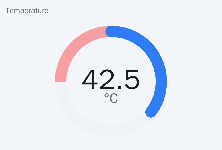
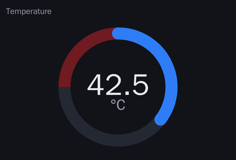
ui.gauge("temp", "Temperature", 0, 120, "°C").style("round").zone(90, 120, "#ff0000");| Prop | Type | Default | Meaning |
|---|---|---|---|
min, max | number | 0, 100 | Range |
unit | string | none | Unit |
zones | [{from,to,color}] | none | Colored ranges, .zone(from, to, color) repeatable |
style | arc, round, linear | arc | Look |
Value: number, face.set("temp", 42.5f).
progress


ui.progress("bal", "Balance", -100, 100).center();| Prop | Type | Default | Meaning |
|---|---|---|---|
min, max | number | 0, 100 | Range |
center | bool | false | Bipolar bar growing from the middle |
color | string | theme | Bar color |
Value: number.
display
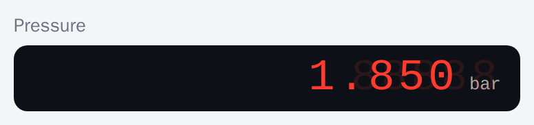
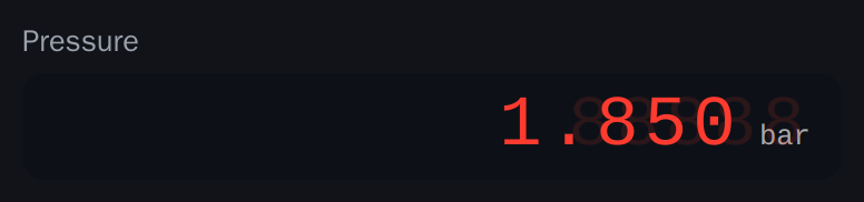
ui.display("disp", "Pressure", 5, "bar");| Prop | Type | Default | Meaning |
|---|---|---|---|
digits | int | 4 | Number of 7-segment digits |
unit | string | none | Unit |
Value: number or string.
led


ui.led("ok", "OK", "#00ff00");
ui.led("rgb", "Status").rgb();| Prop | Type | Default | Meaning |
|---|---|---|---|
color | string | theme | On color |
rgb | bool | false | The value is a color instead of on/off |
Value: bool, or int 0xRRGGBB with .rgb(): face.set("rgb", (uint32_t)0x00ff00).
chart
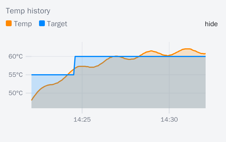
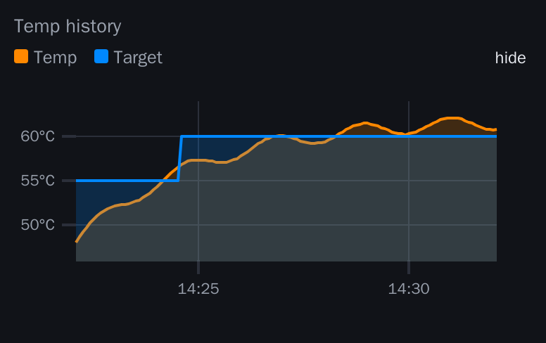
ui.chart("tchart", "Temp history", 600, "°C")
    .series("temp", "Temp", "#ff8800").series("target", "Target", "#0088ff")
    .style("area").legend(true).values(false);
face.push("tchart", "temp", t);| Prop | Type | Default | Meaning |
|---|---|---|---|
series | [{id,lbl,color}] | none | Series, .series(id, lbl, color) repeatable |
win | number (s) | 300 | Time window |
unit | string | none | Unit |
style | line, bar, area | line | Look |
legend | bool | true | Show legend |
vals | bool | false | Show current values |
No value; points arrive as pts messages, sent by face.push(chartId, seriesId, v). Clients keep a ring buffer sized by win, at most 5000 points per series.
log
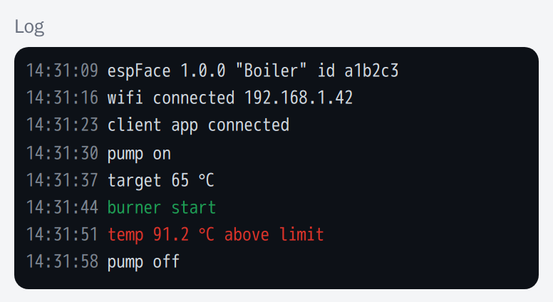
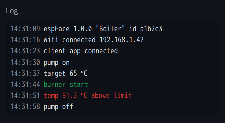
ui.log("term", "Log", 200, 8);
face.log("term", "pump started", "#00aa00");| Prop | Type | Default | Meaning |
|---|---|---|---|
rows | int | 5 (builder: 8) | Visible rows |
cap | int | 200 | Lines kept by the client (clients keep at most 2000) |
No value; lines arrive as log messages through face.log(id, msg, color). face.log(msg) without id goes to the device console view.
table
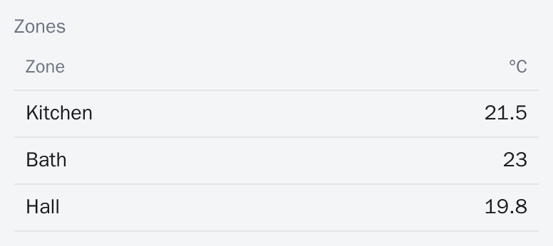
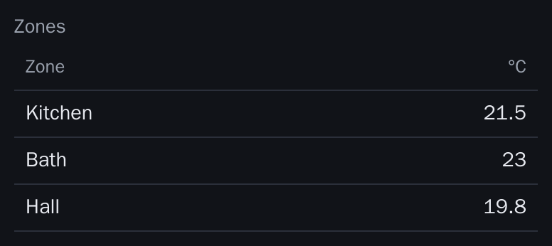
ui.table("tbl", "Zones").column("Zone", 2).column("°C", 1, "right");
face.setRows("tbl", "[[\"Kitchen\",21.5],[\"Bath\",23]]");| Prop | Type | Default | Meaning |
|---|---|---|---|
cols | [{lbl,w,align}] | none | .column(lbl, w=1, align="left"), at least one required |
Value: array of rows (string or number cells), set with face.setRows(id, json).
image
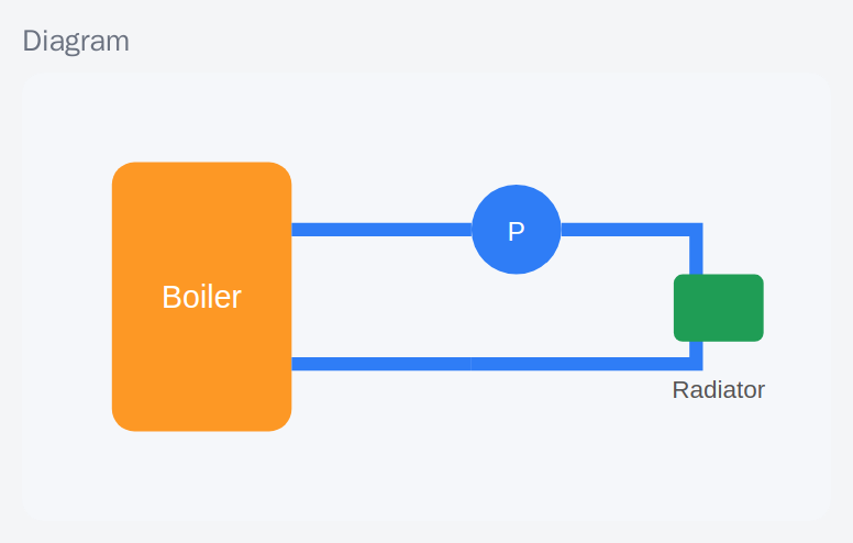
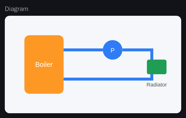
ui.image("img", "Diagram", "https://example.com/diagram.png");
ui.prop("img").src("https://example.com/other.png");| Prop | Type | Default | Meaning |
|---|---|---|---|
src | string | required | Image URL, changeable with prop |
No value. The client loads the URL itself.
stream
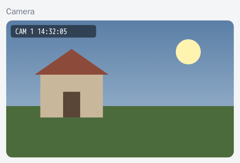
ui.stream("cam", "Camera", "http://192.168.1.60:81/stream");| Prop | Type | Default | Meaning |
|---|---|---|---|
src | string | required | MJPEG stream URL |
No value.
clock


ui.clock("now", "Device time", "HH:mm:ss");| Prop | Type | Default | Meaning |
|---|---|---|---|
fmt | string | client default | Time format |
Value: int unix seconds. The library pushes the device time every minute and the client ticks it locally.
map
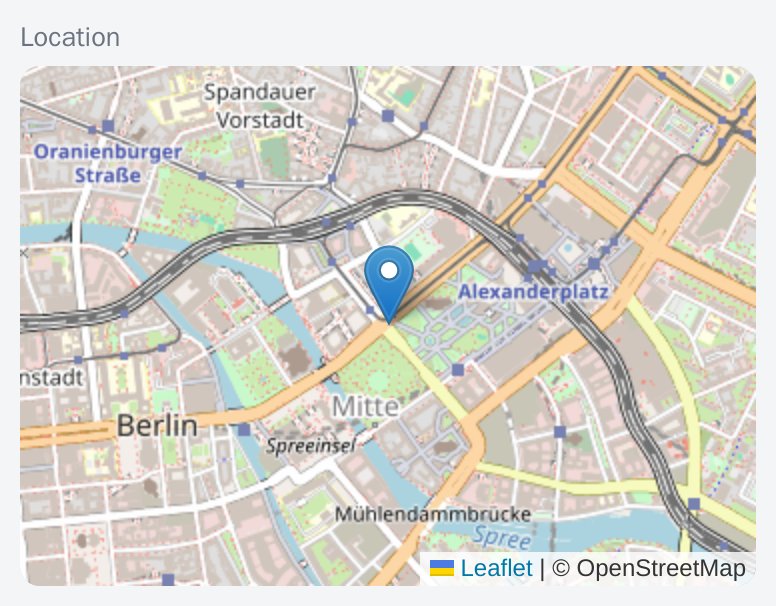
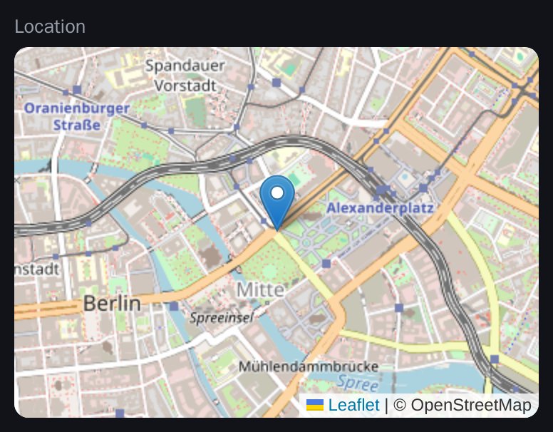
ui.map("pos", "Location", 14);
face.setPoints("pos", "[[52.52,13.405,\"Boiler\"]]");| Prop | Type | Default | Meaning |
|---|---|---|---|
zoom | int | 12 | Initial zoom |
Value: array of [lat, lon, lbl], set with face.setPoints(id, json). Tiles load from the internet; the web renderer fetches Leaflet lazily from cdnjs.
textblock


ui.textblock("help", "Set the target and enable the pump.");| Prop | Type | Default | Meaning |
|---|---|---|---|
text | string | required | Paragraph, changeable with ui.prop(id).text(..) |
No value.
Inputs
button


ui.button("reset", "Reset error").icon("restart_alt").onClick([] { err = 0; });
ui.button("horn", "Horn").hold().onEvent([](int v) { digitalWrite(HORN, v); });| Prop | Type | Default | Meaning |
|---|---|---|---|
color | string | theme | Button color |
hold | bool | false | Send press (1) and release (0) |
No value; the client sends ev. onClick runs on a tap, onEvent(int) receives 1 on press and 0 on release for hold buttons.
switch


ui.sw("pump", "Pump").labels("ON", "OFF").onChange([](bool on) { digitalWrite(PUMP, on); });| Prop | Type | Default | Meaning |
|---|---|---|---|
on, off | string | none | State labels, .labels(on, off) |
color | string | theme | Accent |
Value: bool. The builder method is sw, not switch.
slider
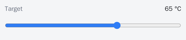
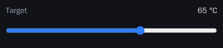
ui.slider("target", "Target", 20, 90, 1, "°C").persist().onChange([](float v) { target = v; });| Prop | Type | Default | Meaning |
|---|---|---|---|
min, max, step | number | 0, 100, 1 | Range and step |
unit | string | none | Unit |
color | string | theme | Accent |
Value: number (float).
number
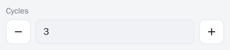
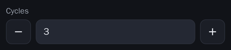
ui.number("cycles", "Cycles", 0, 10).spin().bind(cycles);| Prop | Type | Default | Meaning |
|---|---|---|---|
min, max, step | number | 0, 100, 1 | Range and step |
unit | string | none | Unit |
spin | bool | false | Show plus and minus buttons |
Value: number (float; bind(int&) also works). Out-of-range values are answered with err 7.
text
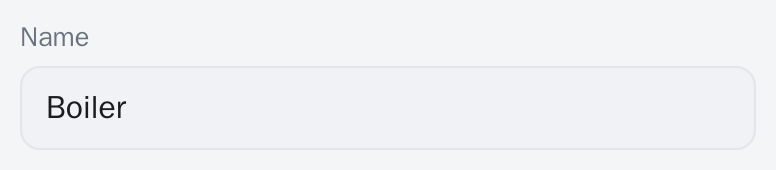
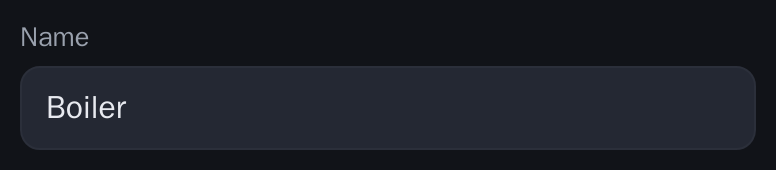
ui.text("name", "Name", 32).regex("^[A-Za-z ]*$").persist().onChange([](const Str& s) { });
ui.text("pw", "Password", 64).secret();| Prop | Type | Default | Meaning |
|---|---|---|---|
maxlen | int | 64 (builder) | Maximum length |
secret | bool | false | Mask the input |
re | string | none | Regular expression the value must match |
Value: string.
textarea
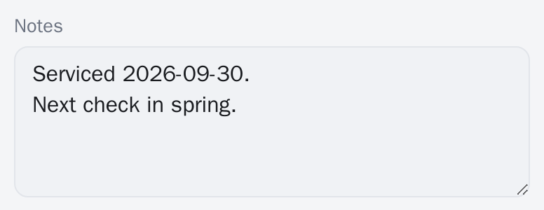
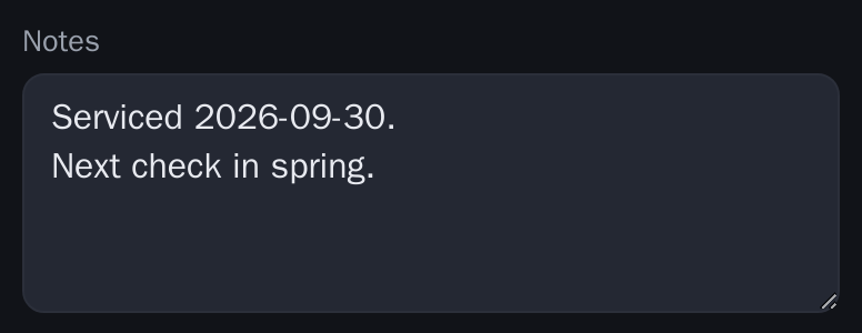
ui.textarea("notes", "Notes", 512, 4).persist();| Prop | Type | Default | Meaning |
|---|---|---|---|
maxlen | int | 256 (builder) | Maximum length |
rows | int | 5 (builder: 4) | Visible rows |
Value: string.
select
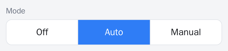
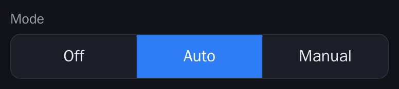
ui.select("mode", "Mode", {"Off", "Auto", "Manual"}).style("seg").onChange([](int i) { mode = i; });
ui.prop("mode").options({"Off", "Eco", "Turbo"});| Prop | Type | Default | Meaning |
|---|---|---|---|
opts | string[] | required | Options, changeable with prop(id).options({..}) |
style | list, seg | list | Dropdown or segmented control |
Value: int index.
flags
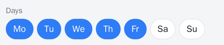
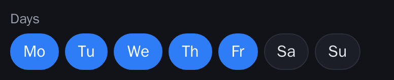
ui.flags("days", "Days", {"Mo", "Tu", "We", "Th", "Fr", "Sa", "Su"}).persist().onChange([](uint32_t m) { days = m; });| Prop | Type | Default | Meaning |
|---|---|---|---|
opts | string[] | required | Checkbox labels, at most 32 |
Value: int bitmask, bit 0 is the first option.
color
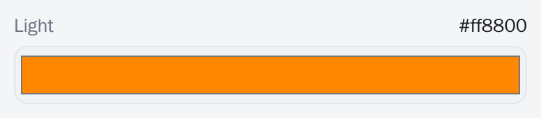
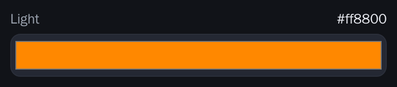
ui.color("col", "Light").persist().onChange([](uint32_t rgb) { face.set("rgb", rgb); });No type-specific props. Value: int 0xRRGGBB.
datetime
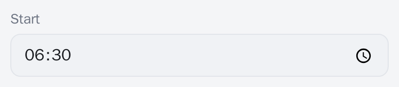
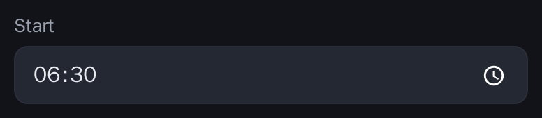
ui.datetime("start", "Start", "time").persist();| Prop | Type | Default | Meaning |
|---|---|---|---|
mode | date, time, datetime | datetime | What the picker offers, .mode(..) |
Value: int unix seconds. In time mode the value is seconds since midnight in the demo UI.
joystick
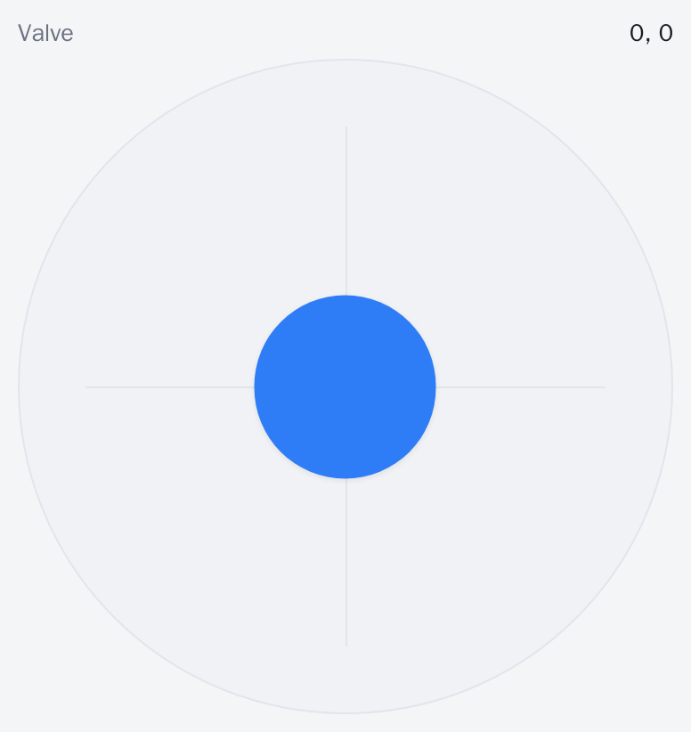
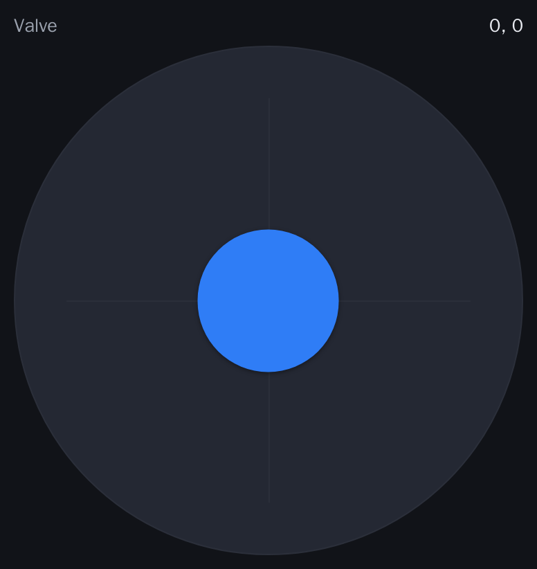
ui.joystick("joy", "Valve").center().square().onMove([](int x, int y) { vx = x; vy = y; });
face.set("joy", 0, 0);| Prop | Type | Default | Meaning |
|---|---|---|---|
center | bool | false | Springs back to the middle on release |
exp | bool | false | Exponential response curve |
Value: pair [x, y], each -100 to 100.
dpad
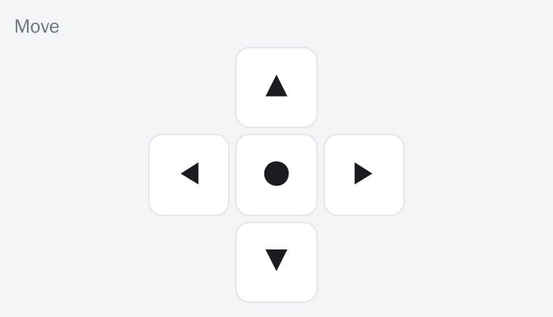
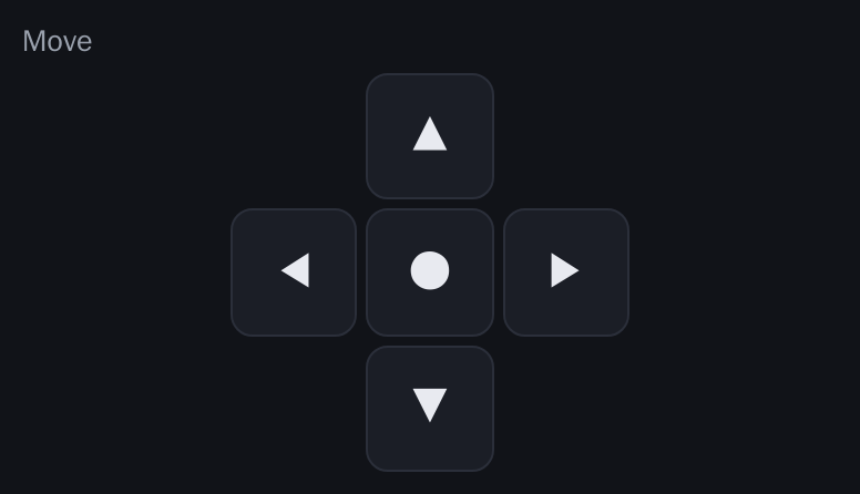
ui.dpad("pad", "Move").onEvent([](int k) {   // 'u','d','l','r','c' on press, 0 on release
  if (k) Serial.printf("dpad %c\n", (char)k);
});
No type-specific props, no value; the client sends ev with v.
Structure
header


ui.header("Fake boiler");No props beyond the label.
group
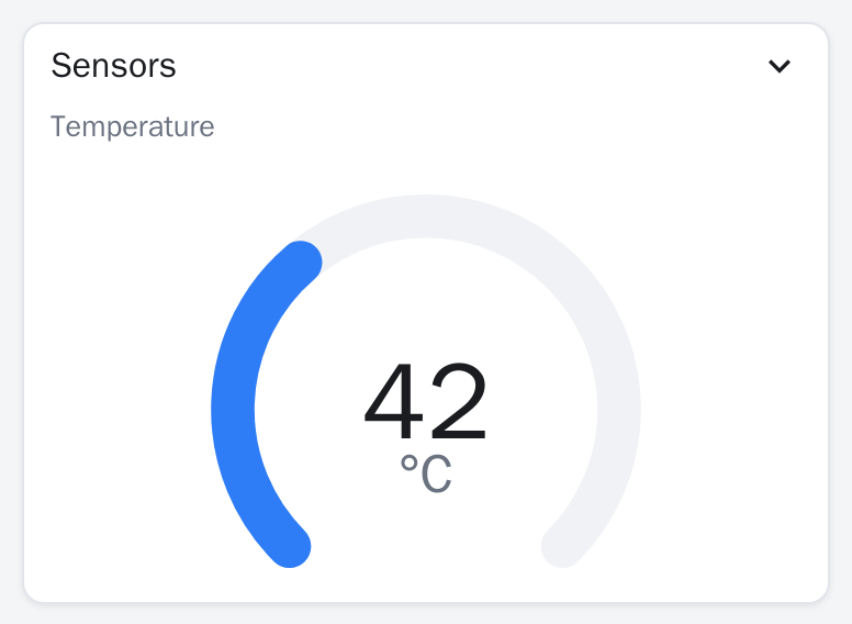
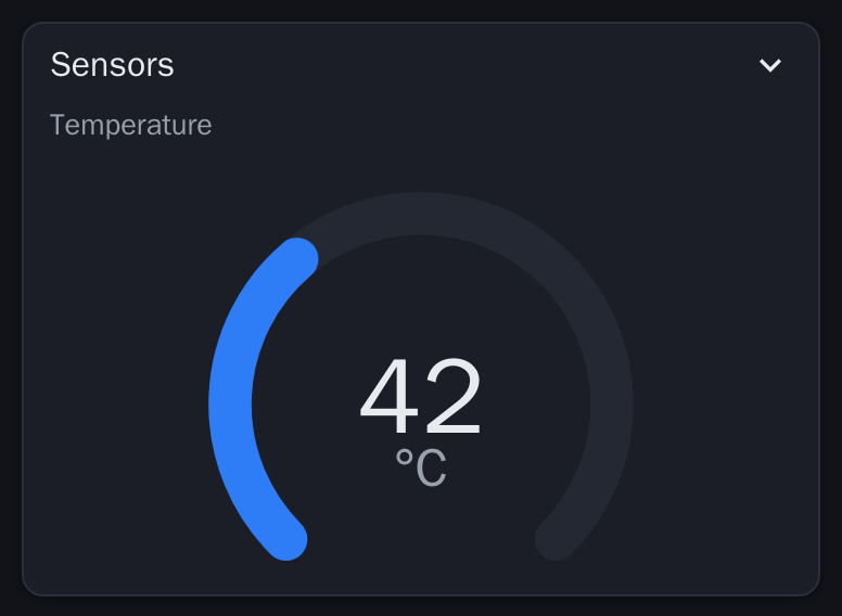
ui.group("sensors", "Sensors").fold();
ui.gauge("temp", "Temperature", 0, 120).group("sensors");| Prop | Type | Default | Meaning |
|---|---|---|---|
fold | bool | false | Card can be collapsed by tapping its header; it starts open and the fold state lives in the client |
Declare it before the widgets that join it.
page
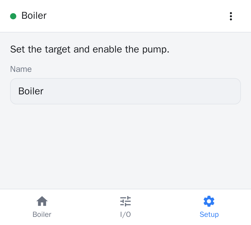
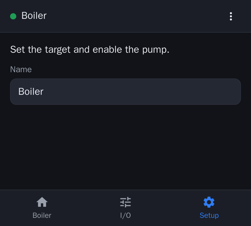
ui.page("setup", "Setup").icon("settings");A page becomes a tab or bottom-navigation entry. Widgets declared afterwards belong to it.
row
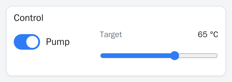
ui.group("control", "Control");
ui.row("r1").group("control");
ui.sw("pump", "Pump").row("r1").size(2);
ui.slider("target", "Target", 20, 90, 1, "°C").row("r1").size(3);
Widgets with the same row sit side by side; size sets their relative widths.
spacer


ui.row("r1");
ui.button("start", "Start").row("r1");
ui.spacer("sp", 1, 16).row("r1");
ui.button("stop", "Stop").row("r1");
spacer(id, w=1, h=8) adds empty space of the given relative width and pixel height.
Unknown types
A renderer shows any widget type it does not know as a placeholder labelled "unsupported widget". ui.add(WType, id, lbl) creates any type without builder defaults.